01
設計理念
concept

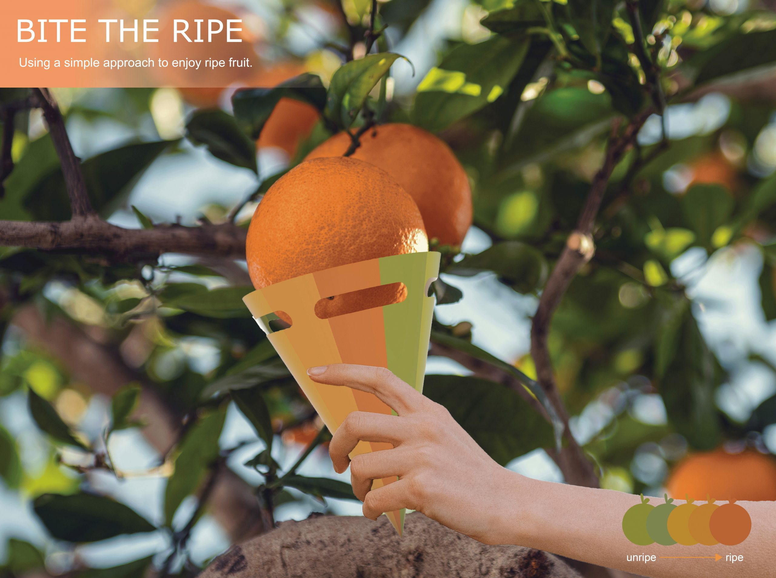
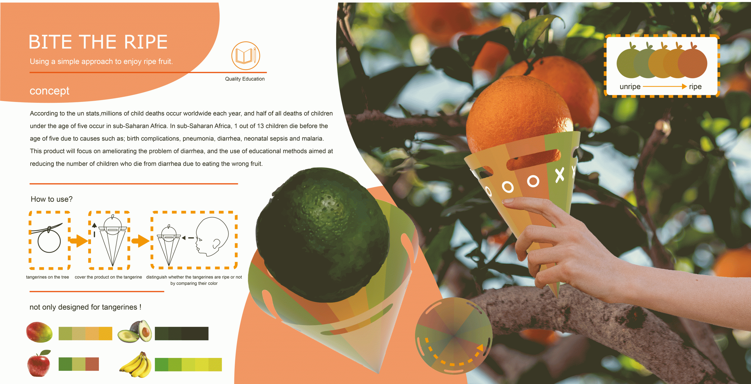
根據聯合國所統計的資料顯示,全世界在每年都有數以百萬計的兒童死亡,尤其是五歲以下兒童死亡的總數,有整整一半是發生在撒哈拉以南的非洲。在撒哈拉以南的非洲,每 13 個兒童中就有 1 個在 5 歲前死亡,原因包括了有:出生並發症、肺炎、腹瀉、新生兒敗血症和瘧疾。這項產品將重點放在如何利用簡單物品進行基礎教育,來間接減少因吃錯未熟水果而死於腹瀉的兒童數量。
According to the un stats,millions of child deaths occur worldwide each year, and half of all deaths of children under the age of five occur in sub-Saharan Africa. In sub-Saharan Africa, 1 out of 13 children die before the age of five due to causes such as; birth complications, pneumonia, diarrhea, neonatal sepsis and malaria. This product will focus on ameliorating the problem of diarrhea, and the use of educational methods aimed at reducing the number of children who die from diarrhea due to eating the wrong fruit.
02
使用方法
How to use?


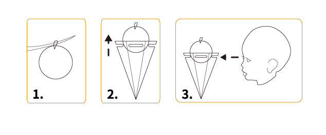
第一步∣ 找到在樹上的果實
第二步∣將產品套到果實上
第三步∣ 對照產品外演色表判斷果物是否成熟
1. tangerines on the tree
2. cover the product on the tangerine
3. distinguish whether the tangerines are ripe or not by comparing their color

03
設計目的與特色
the purpose and the feature

設計目的
1. 減少兒童因誤食未熟的水果而死亡的機會。
2. 增進兒童的辨色能力。
3. 使兒童對於水果成熟的知識有一定的了解。
the purpose of designing the product
1. Reduce the chances of children consuming underipe/overripe fruits by
mistake
2. Develop children's ability to distinguish between colors
3. Provide children with better understanding of fruit ripeness.
設計特色
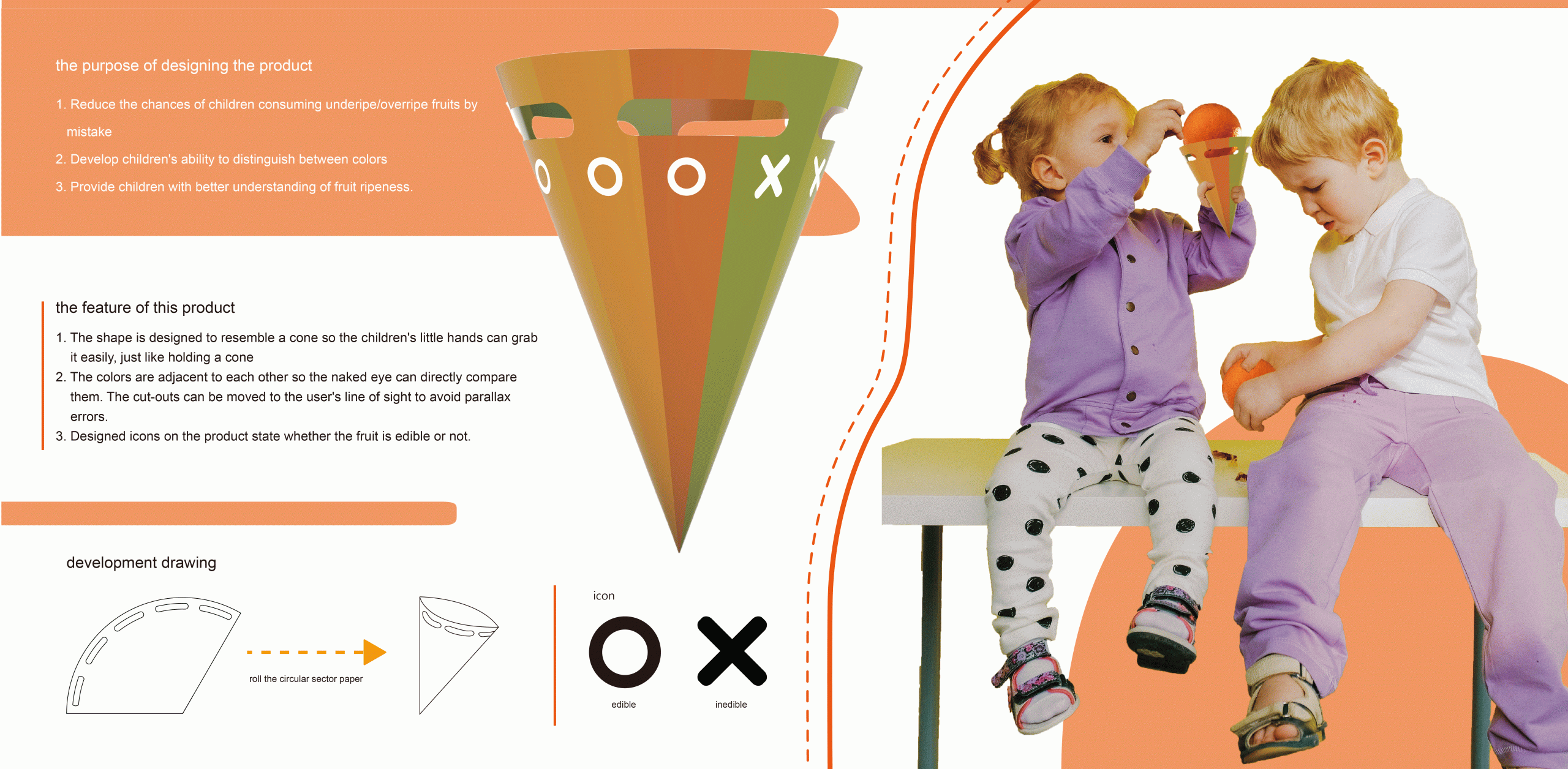
1. 外型設計圓錐狀,方便兒童較小的手能夠輕鬆握住。就像握住甜筒般輕鬆。
2. 顏色皆無縫相鄰,中間也有切口能夠讓使用者方便辨色,不會有視覺差異。
3. 直接的圓圈叉叉圖案,讓不識字的兒童能夠辨別成熟程度。
the feature of this product
1. The shape is designed to resemble a cone so the children's little hands can grab
it easily, just like holding a cone
2. The colors are adjacent to each other so the naked eye can directly compare
them. The cut-outs can be moved to the user's line of sight to avoid parallax errors.
3. Designed icons on the product state whether the fruit is edible or not.
